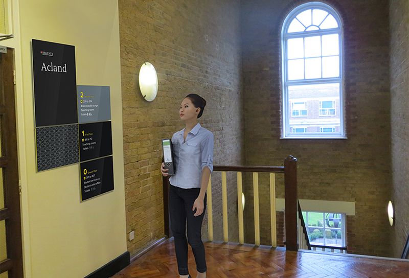
In a world that is increasingly digital, physical signage may seem like a priority of the past. However, the power of an impactful wayfinding system can provide far more than simple directional guidance — it can be an extension of your brand identity.
Smartphone users might wonder if we need physical signs anymore, but one could argue that they are just as integral to our daily lives now as they have ever been. Whether they be street signs, transit signs, signs in malls, parks or universities: signage is all around us, but we only notice it when it goes wrong. Signs are carefully designed objects that form part of a wider system of thought-out information called wayfinding, but they also perform another perhaps less considered role.
Signs and the wayfinding systems they belong to are part of an experience, an extension of a place and the embodiment of a brand. No one system looks or performs the same as the next — otherwise all signs would look the same.
When entering a building, first impressions count. The headquarters of an international company, a world-renowned theatre, museum, gallery or even a university campus: each of these places is there to engage, impress and retain you through positive experiences.
Wayfinding systems are integral to these destinations, as they are highly visible assets. In the first instance, they are relied on to provide concise and accurate information relating to your surroundings and, in the second, they are extensions of a brand’s identity. Signs are vital components of any successful campus wayfinding system, but if you’re not using signs for more than this, you are not taking advantage of all they can really do.
Poor design is easy to spot, whether it be a cheap paper used to print a business card or an unconsidered layout in a printed booklet — these things are noticeable. In the case of signage it is no different: poorly-designed signs, or signs placed without consideration of place or without a considered strategy, will fail. This failure will damage the user experience and the image of your brand.
For universities, the competition for new students and donors is fierce. Wayfinding is a valuable tool, and signs often make the first impression on visitors to your campus, and that first impression may be all you get. Steer Davies Gleave is currently working with Regent’s University London to envision a unified, cohesive wayfinding system that properly reflects the school’s brand. Creating a good first impression through wayfinding can be achieved in a variety of ways, whether through the use of high-quality materials and finishes or through the implementation of clear and consistent information.
Once the potential is realized within an organization — that signs are a powerful medium for visual communication — there are many ways, within a wide range of budgets, to implement a signage and wayfinding program that can do much more than just direct pedestrian traffic.
