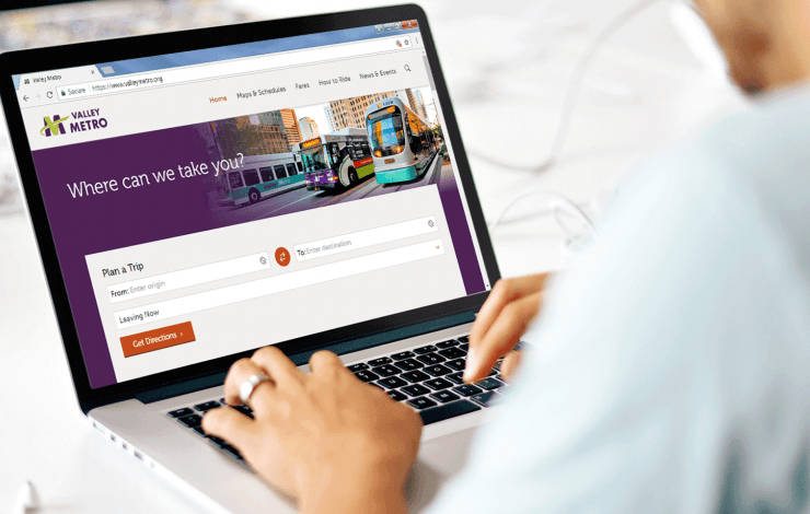
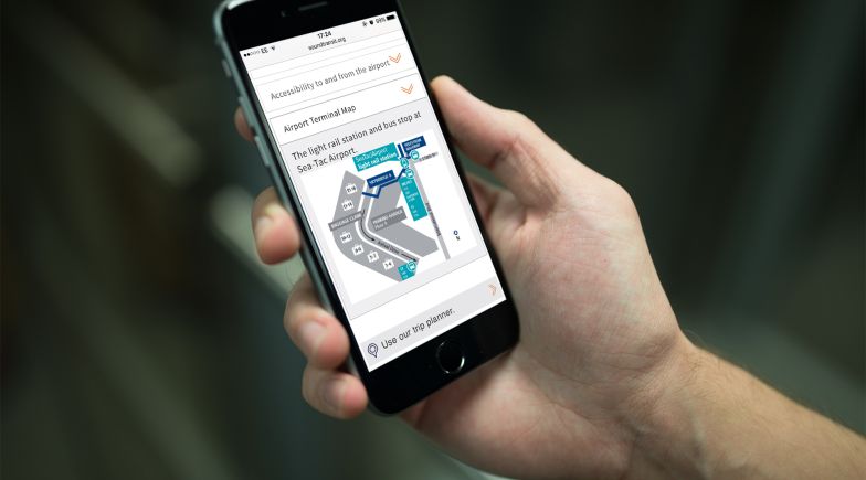
Valley Metro's website wasn't serving the needs of their users, nor the needs of their internal marketing and customer service staff. The site provided key rider tools for over 80 transit routes, such as a trip planner and rider alerts, but wasn't suited to the smartphone format.
The website was well used, with over 56,000 regular monthly visitors - 80% of which do so via a smartphone - however the user experience was often a target for complaints from riders. The website wasn't helping Valley Metro achieve their goals, was difficult to use, and was cumbersome to maintain. In some cases, it was also inaccessible for blind and partially sighted users.
Steer, working in partnership with Valley Metro, was commissioned to design and develop a new mobile responsive website and, along the way, completely transform the way that Valley Metro handled, managed and analysed their digital transit datasets and engaged with their users.
We delivered:
- A brand new, user-centered, data-driven, mobile responsive website - using Drupal 7 CMS for easy editing
- Screen reader features for blind and partially sighted users, in line with WCAG 2.0AA guidelines
- A nextgen schedule data post-processing system, using GTFS and GTFS-RT
- A new trip planner, powered by Google Maps Directions API, with integrated rider alerts
- A nextgen Rider Alerts system for multi-channel information delivery - including the website, trip planner and Google Maps
- A new API for real time information and alerts, in the GTFS-RT format
We worked closely with our UX partners, The Glue, to do a 'deep dive' into the agency's current user base to better understand how they use the network and access key information. We learned that riders tended to use the Google Maps app for trip planning, but checked the Valley Metro website for schedule accuracy and rider alerts updates. Customers preferred the user experience offered by Google Maps, but didn't trust the data. We decided to tackle this head-on by designing an intuitive, mobile-responsive, trip planner and integrating real-time rider alerts with Google Maps and the new website.
Since launching the site in December 2017, we have used data captured by Google Analytics and feedback sourced by Customer Service front-line staff to continually improve the website. This includes tweaks to the way screenreaders access information, address look-ups on the trip planner and improving the quality of bus stop data to make it easier to access next departure information.


